" height="38px" id="FCsSV0e2z" width="38px"/></svg>)


Reduce abandoned carts by 20%
Reduce abandoned carts by 20%
Reduce abandoned carts by 20%
The goal of the website redesign was to improve usability, optimize the user journey, and increase conversion rates.
The goal of the website redesign was to improve usability, optimize the user journey, and increase conversion rates.
The goal of the website redesign was to improve usability, optimize the user journey, and increase conversion rates.

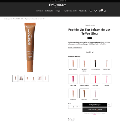
Problem
Not displaying product variants directly on the product card forced users to navigate through multiple product pages to view available options, such as lip tint shades. This led to frustration and a longer user journey.
Solution
We added color variants directly to the product card, using packaging visuals that reflect each shade. This gave users an instant overview of the available options, improving discoverability and reducing frustration.
Good To Add In The Future
Formula variants can be displayed as “blobs” instead of full product rows. This will reduce scrolling and make option comparison more efficient on smaller screens.
-20%
Lower cart abandonment rate
at the payment stage
-6%
Lower cart abandonment rate
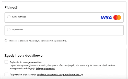
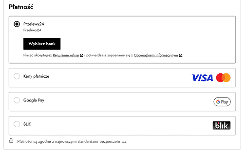
Problem
A limited selection of payment options, especially the dominance of cash-on-delivery, led to high cart abandonment and a spike in unpaid returns.
Solution
The checkout process was redesigned to include multiple payment options. This helped lower cart abandonment rates and significantly decreased.
Good To Add In The Future
Adding quick login options (e.g., Google sign-in) directly from the cart will enhance accessibility and speed up the purchase process.
Additionally, change the visual hierarchy and layout of form fields will improve clarity during data input and reduce flustration at checkout.
-20%
Lower cart abandonment rate
at the payment stage
-6%
Lower cart abandonment rate
TOP 2
The two most common clicks
are selecting variants
-10,4%
Drop in cart abandonment rate. at the payment stage
-5%
Drop in cart abandonment rate during product adding stage

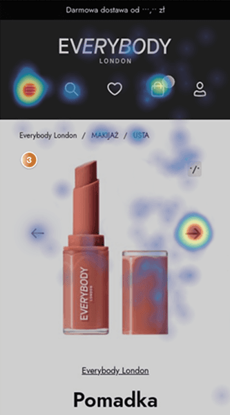
Problem
The main product image was among the top 3 most-clicked elements. However, tapping the image on mobile didn’t trigger any interaction. Additionally, unlike the desktop version, there was no visible image carousel under the main photo, limiting users’ access to additional product photos.
Solution
To improve usability on mobile, we added navigation arrows to the product image section, allowing users to easily browse other photos. Instead of duplicating the full desktop-style carousel, we decided for arrows to create clean and more compact layout for smaller screens.
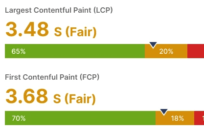
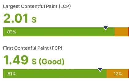
Problem
The homepage suffered from poor performance due to slow loading time, primarily caused by too many high-resolution images with large file sizes.
Solution
In cooperation with the developer the site was optimized by compressing and converting images
to web-friendly formats (.WebP). This improved loading speed.
Good To Add In The Future
Reducing the number of plugins
Speed tests show that many plugins increase memory usage, which slows down perceived load time and disrupts the user journey.
~1K
Less Rage Clicks
Loading Time
~10MB Less
Page weight during the first load